Museum of Sex
Brand Identity, Creative Strategy
The Museum of Sex is located in New York. It aims to preserve and present the history, evolution, and cultural significance of human sexuality.
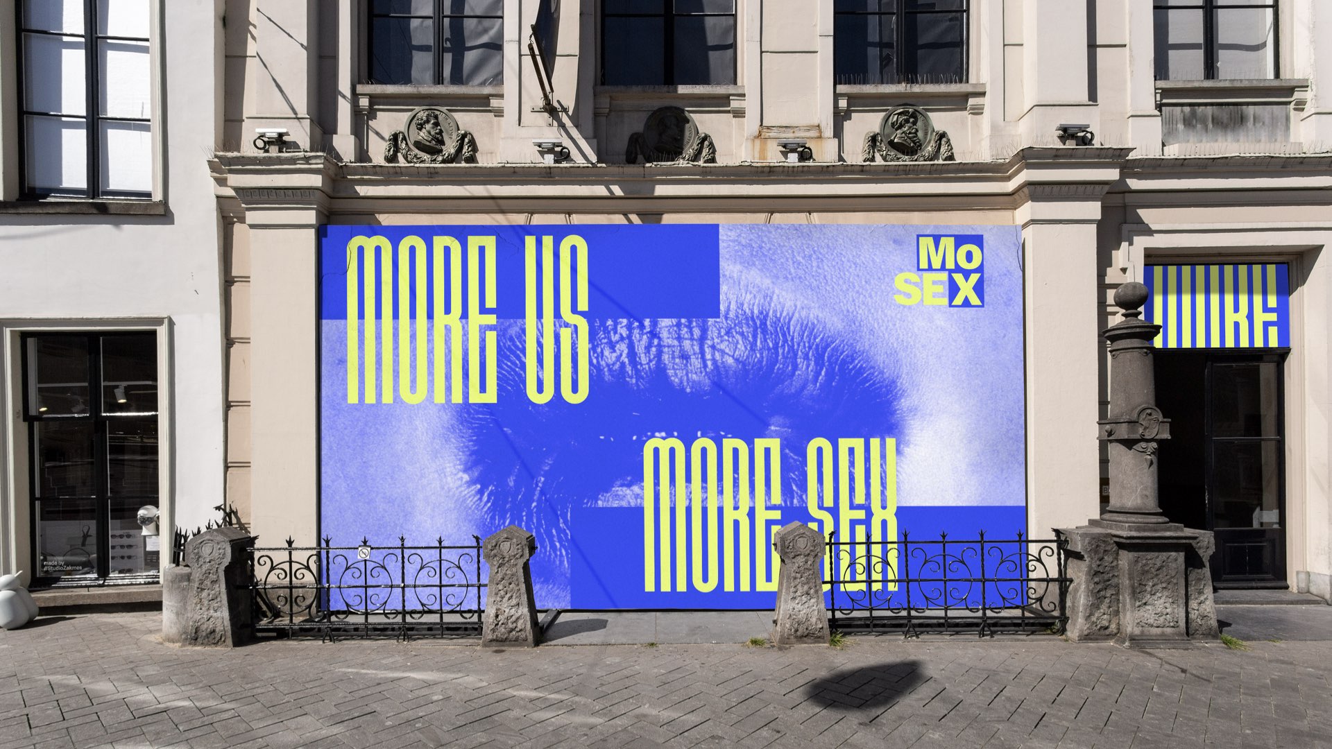
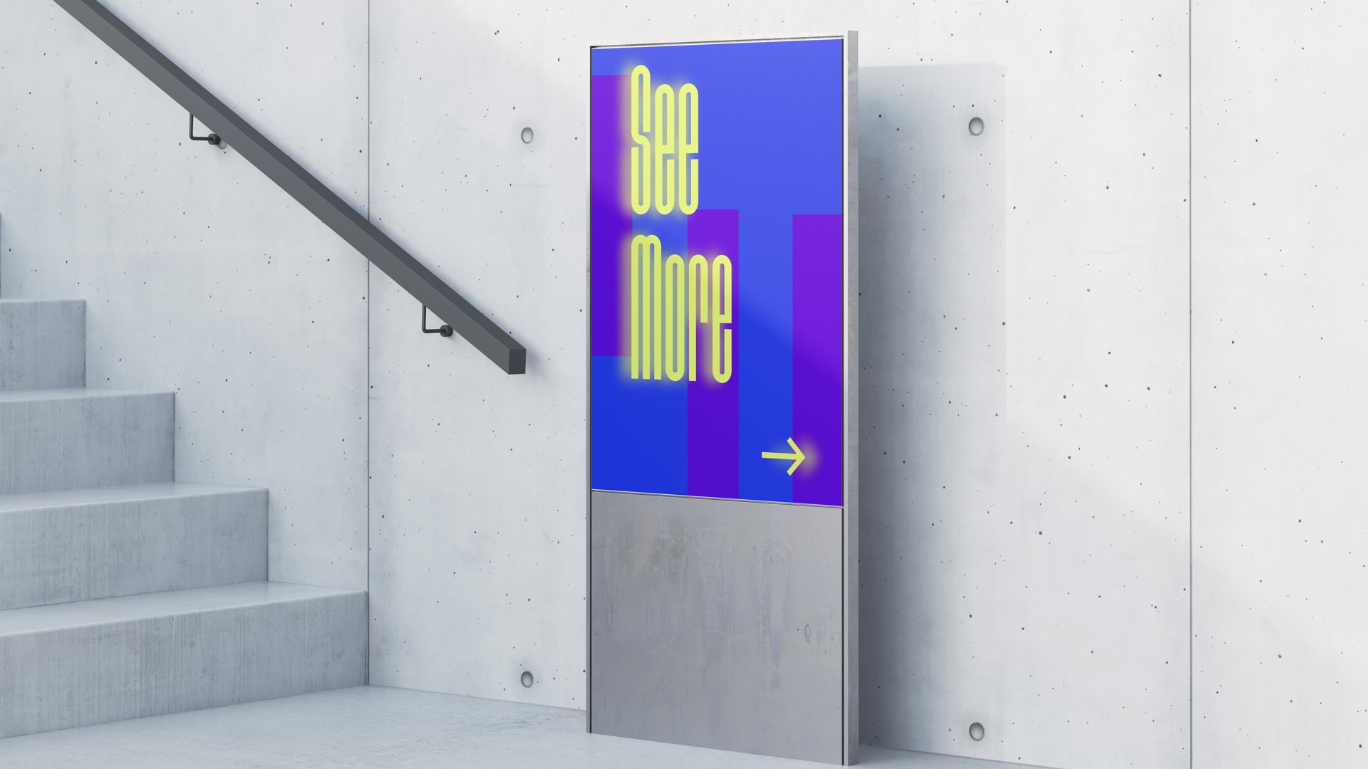
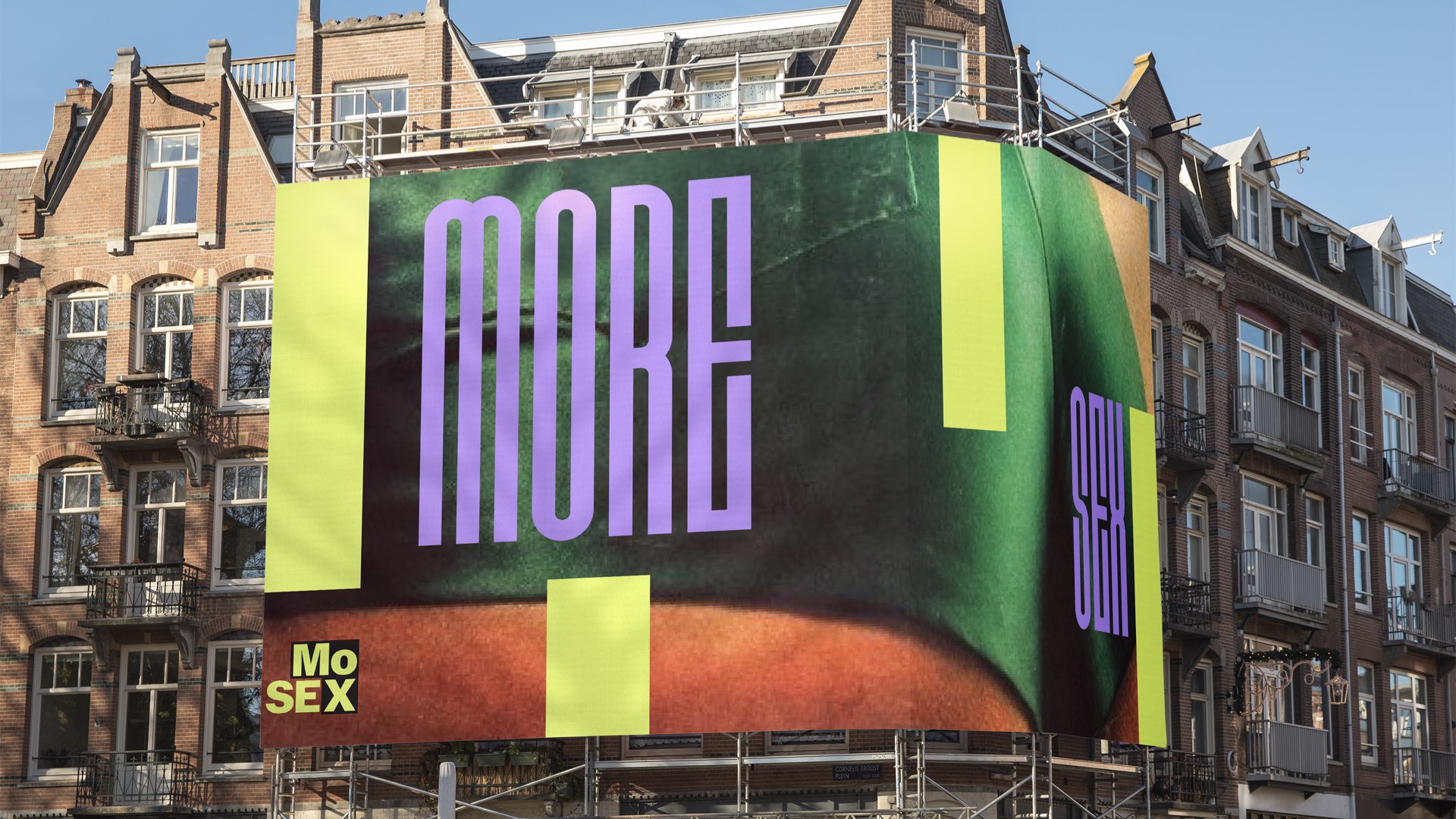
The rebranding of The Museum of Sex is to change how we view discussions about sex, shifting away from negativity. The new visual system takes inspiration from dark blocks used to hide sensitive content in media, but it is not about concealing. It's based on "See More Beyond Dark Blocks," encouraging visitors to explore beyond surface perceptions.
The rebranding of The Museum of Sex is to change how we view discussions about sex, shifting away from negativity. The new visual system takes inspiration from dark blocks used to hide sensitive content in media, but it is not about concealing. It's based on "See More Beyond Dark Blocks," encouraging visitors to explore beyond surface perceptions.
Logo System︎︎︎
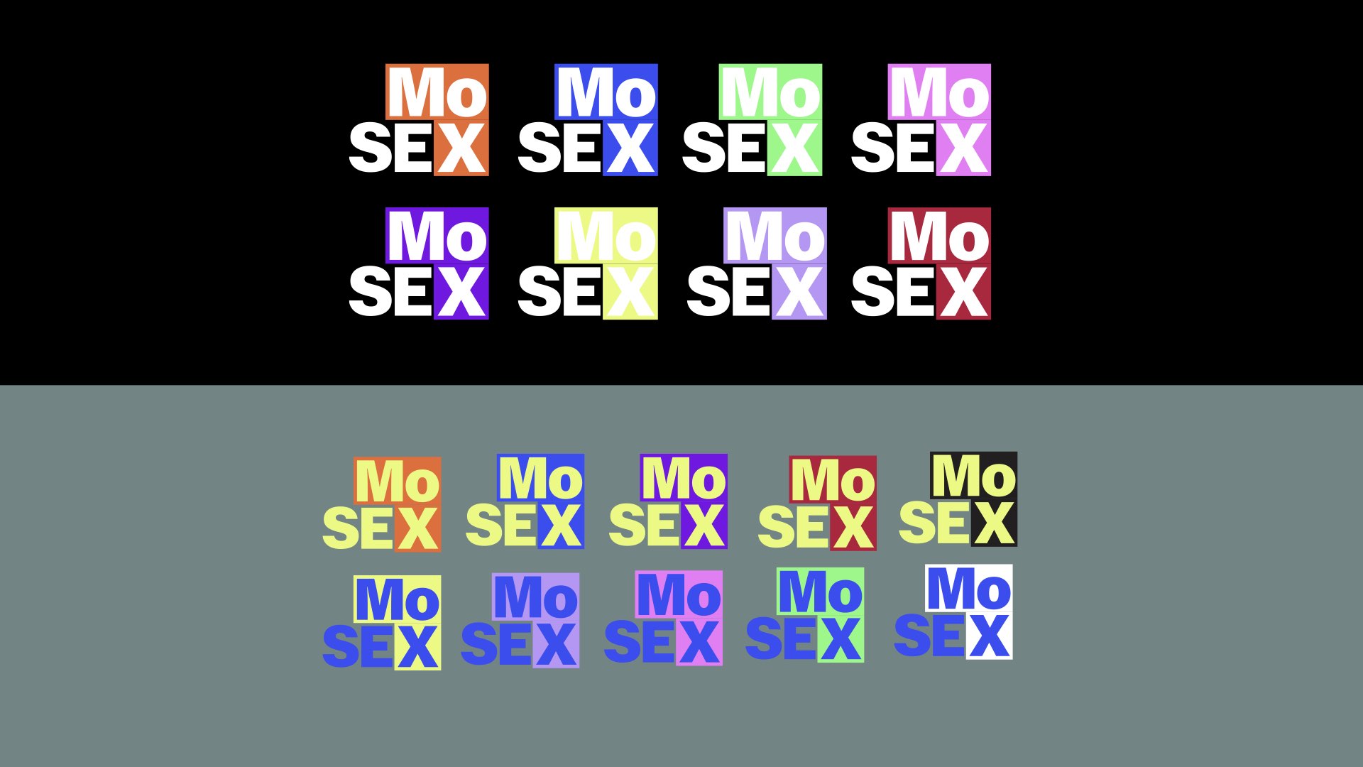
The logo lockup consists of a rectangle and a square. This combination resembles the dark block, which has been used to hide sensitive content in different media.
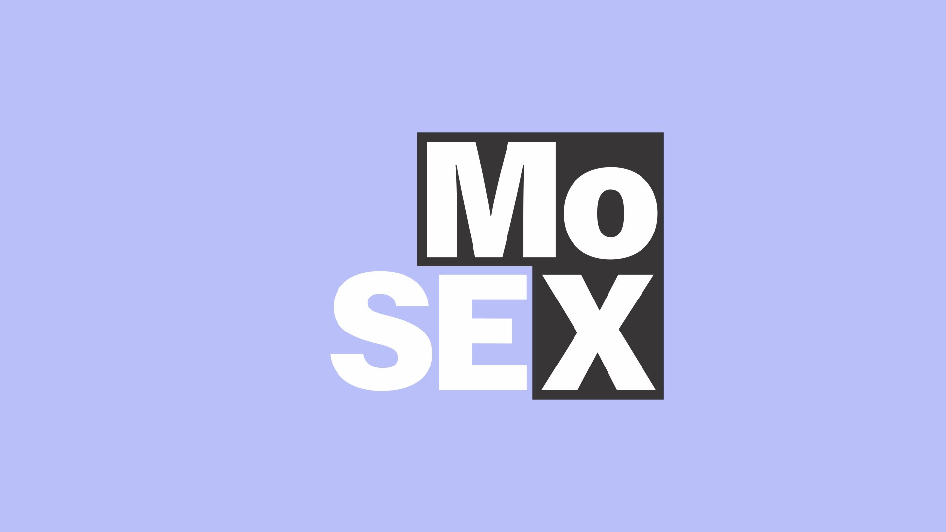
The wordmark in a striking typeface with a tight leading is sitting beyond the dark block to give an attitude about seeing more beyond the hidden stuff related to our brand identity of destigmatizing sexuality to expand our understanding of the world.
Posters︎︎︎
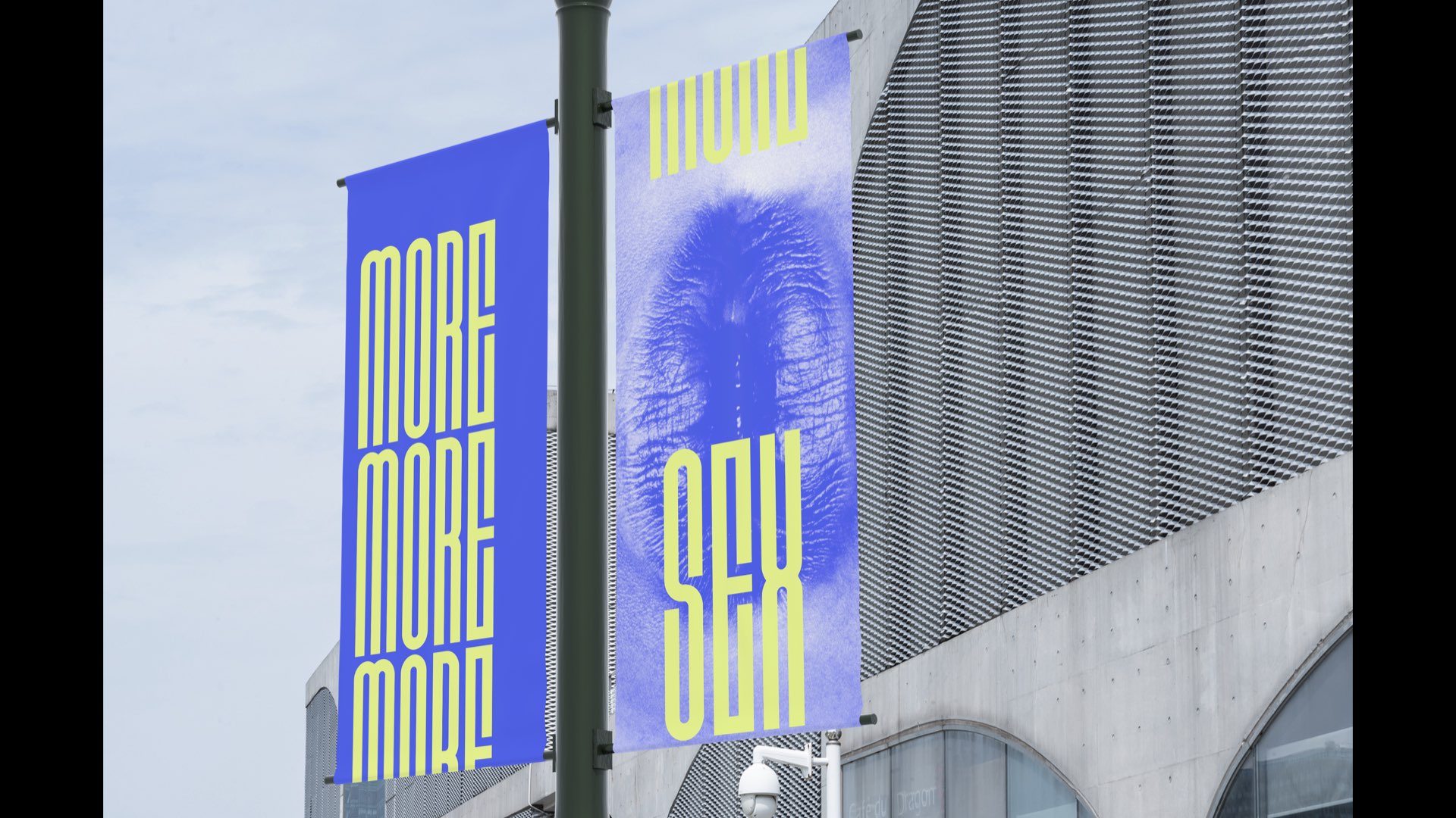
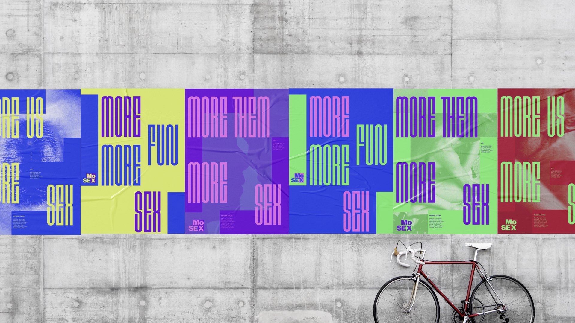
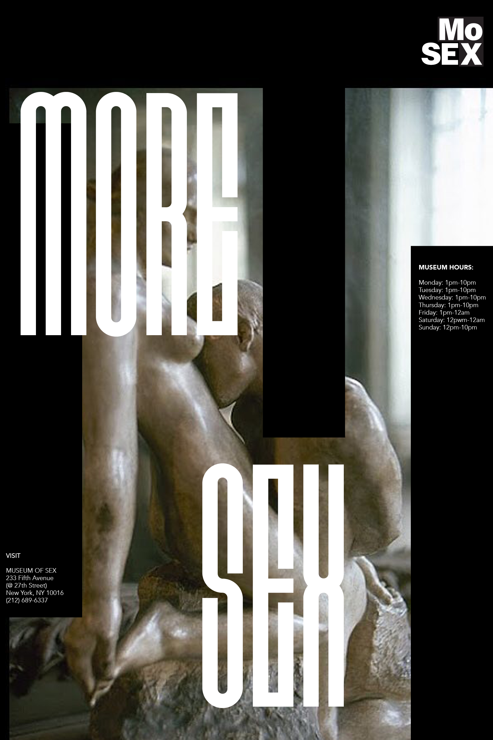
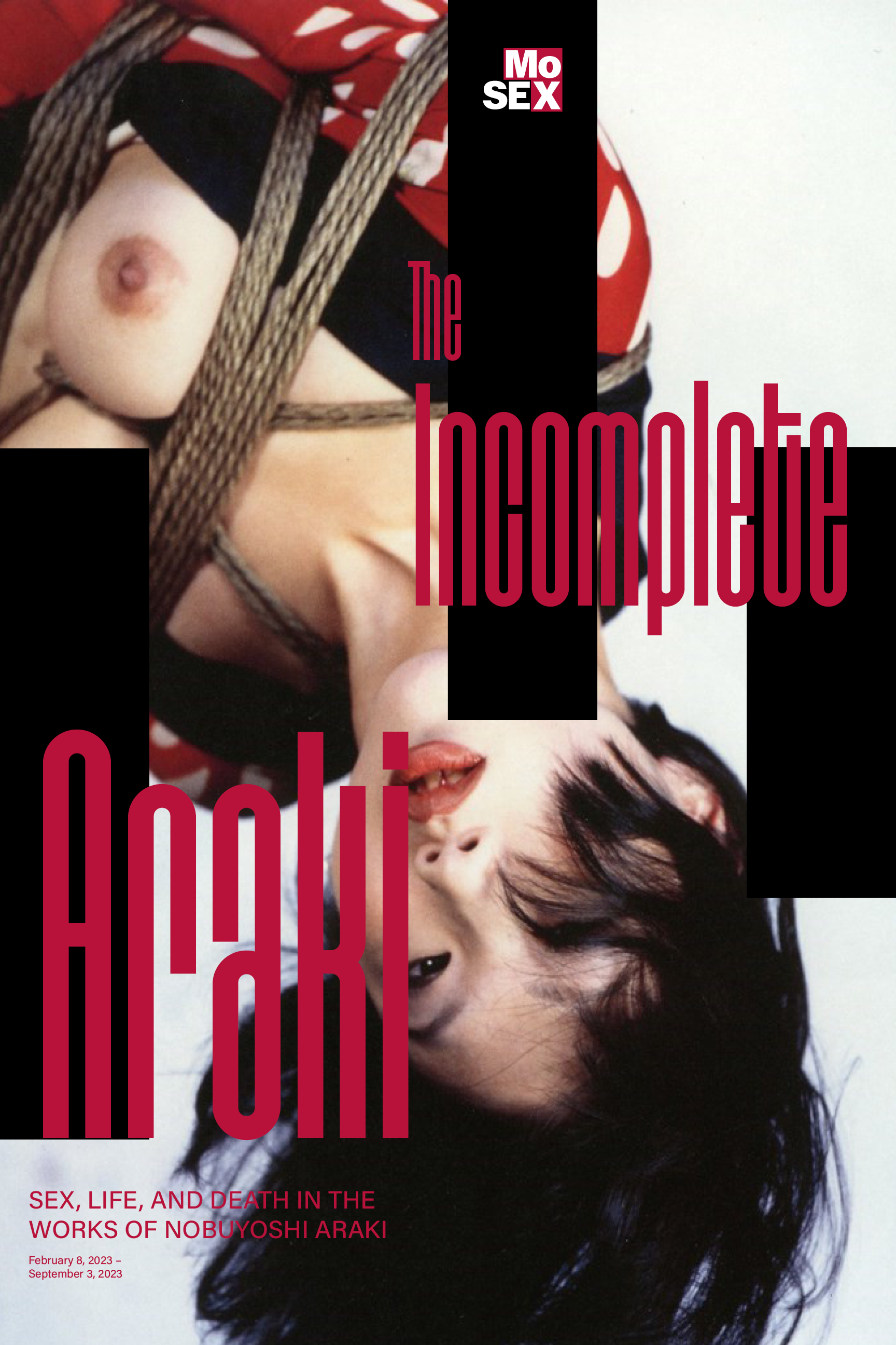
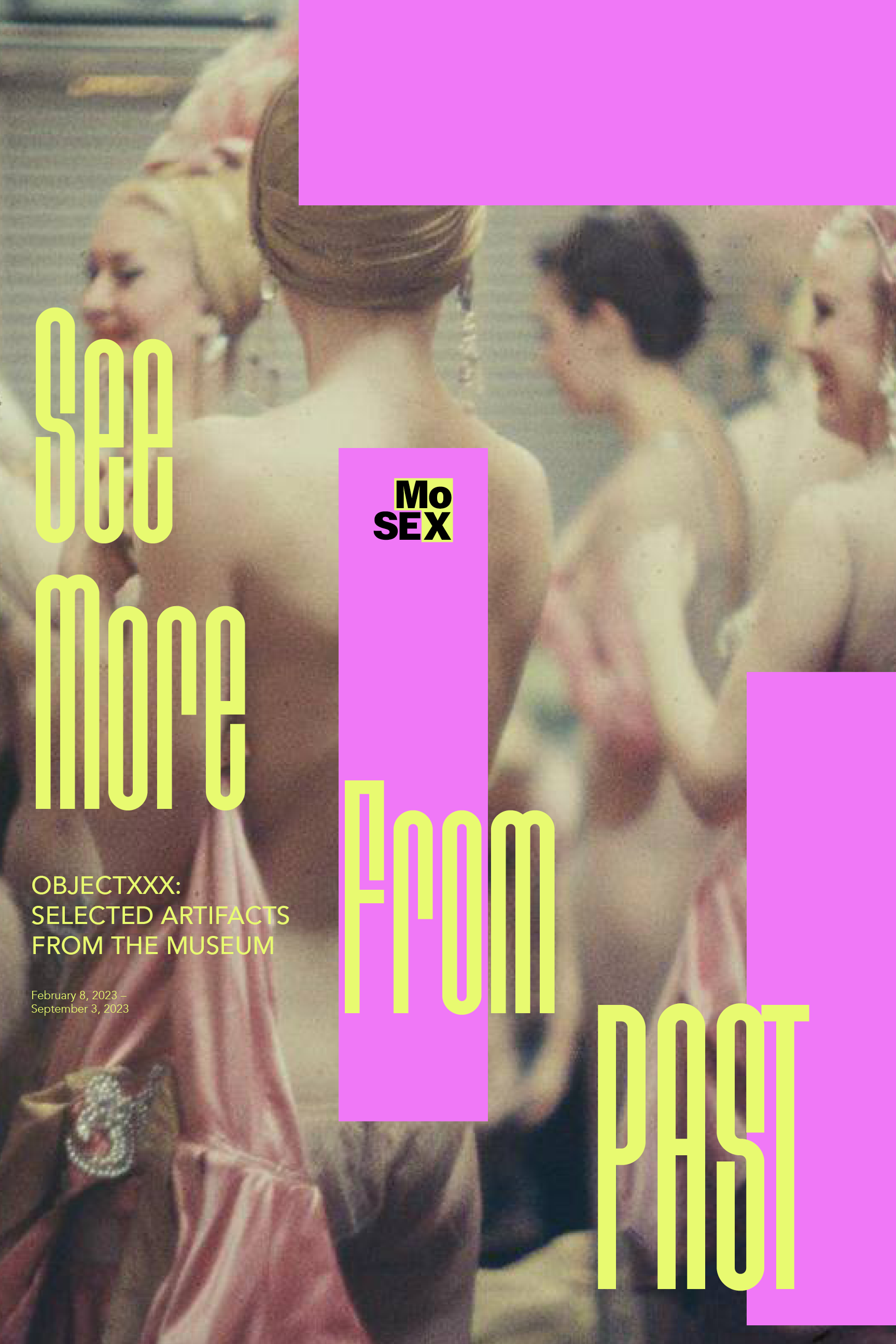
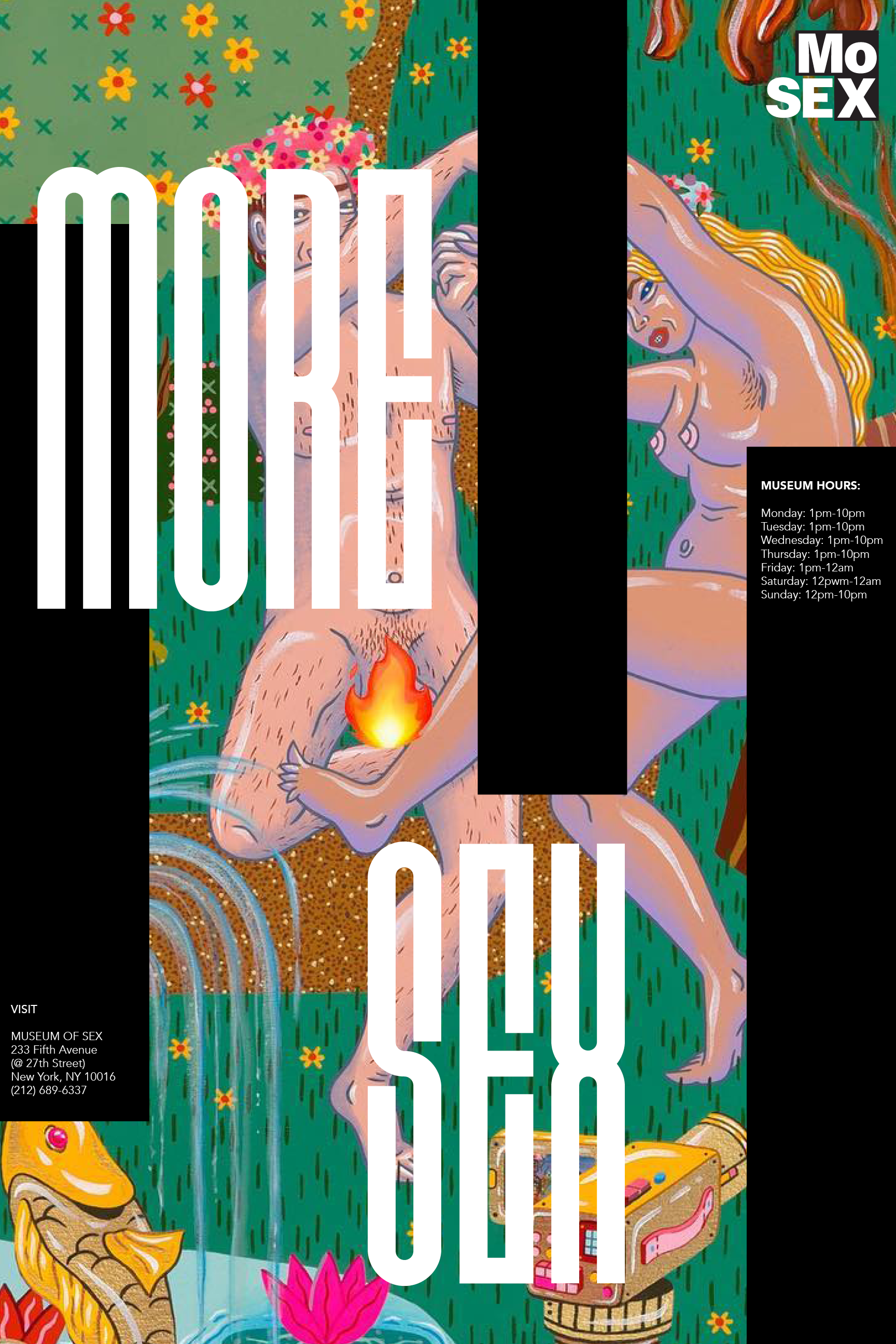
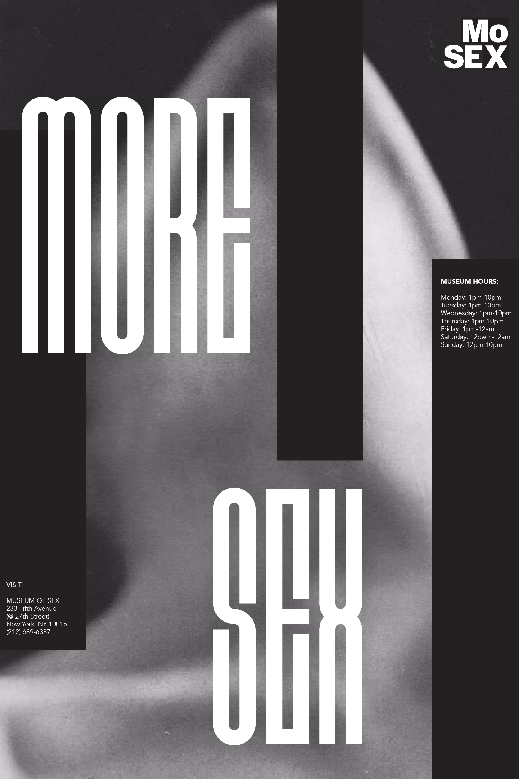
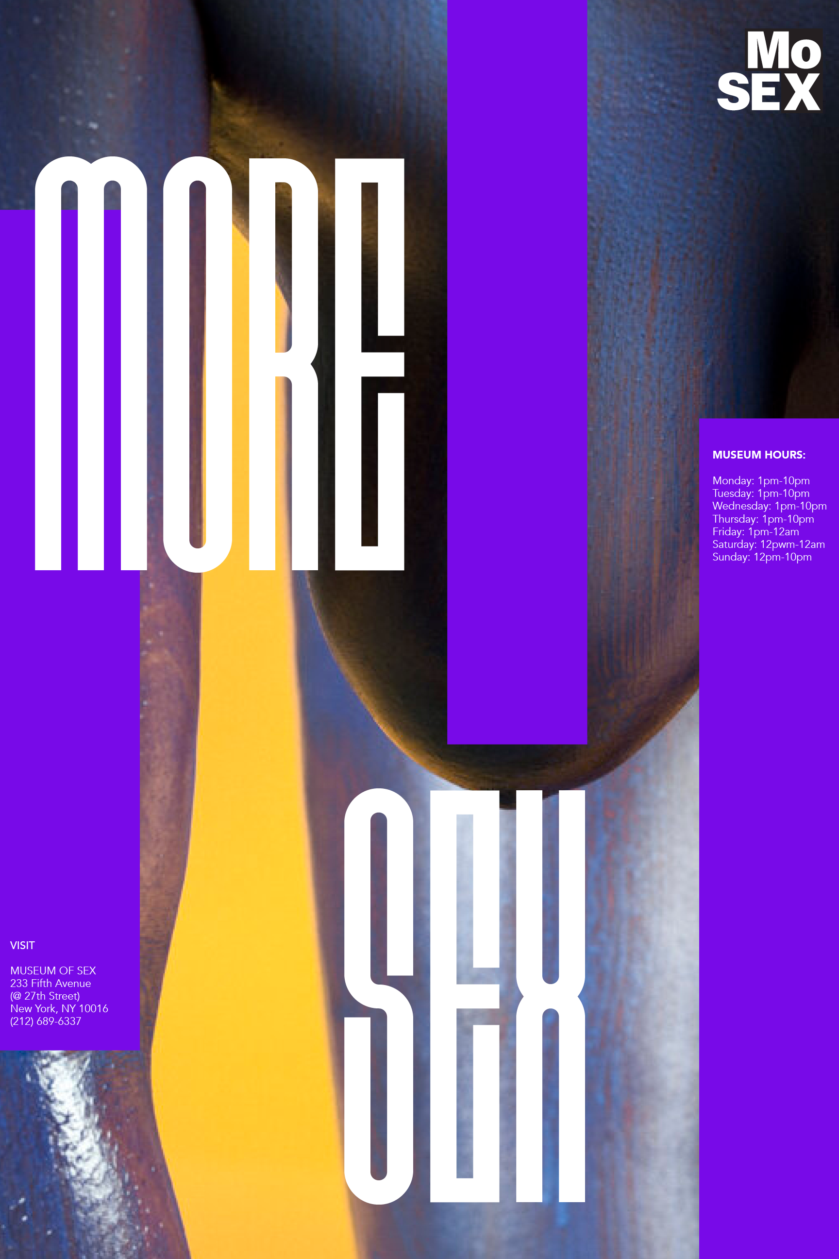
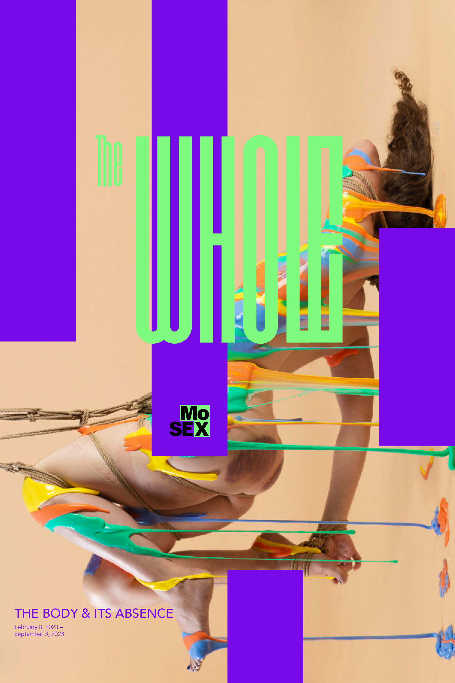
I utilized the rectangle block elements in my logo as the basis for my system and implemented a similar structure in my poster design.


Stationary︎︎︎
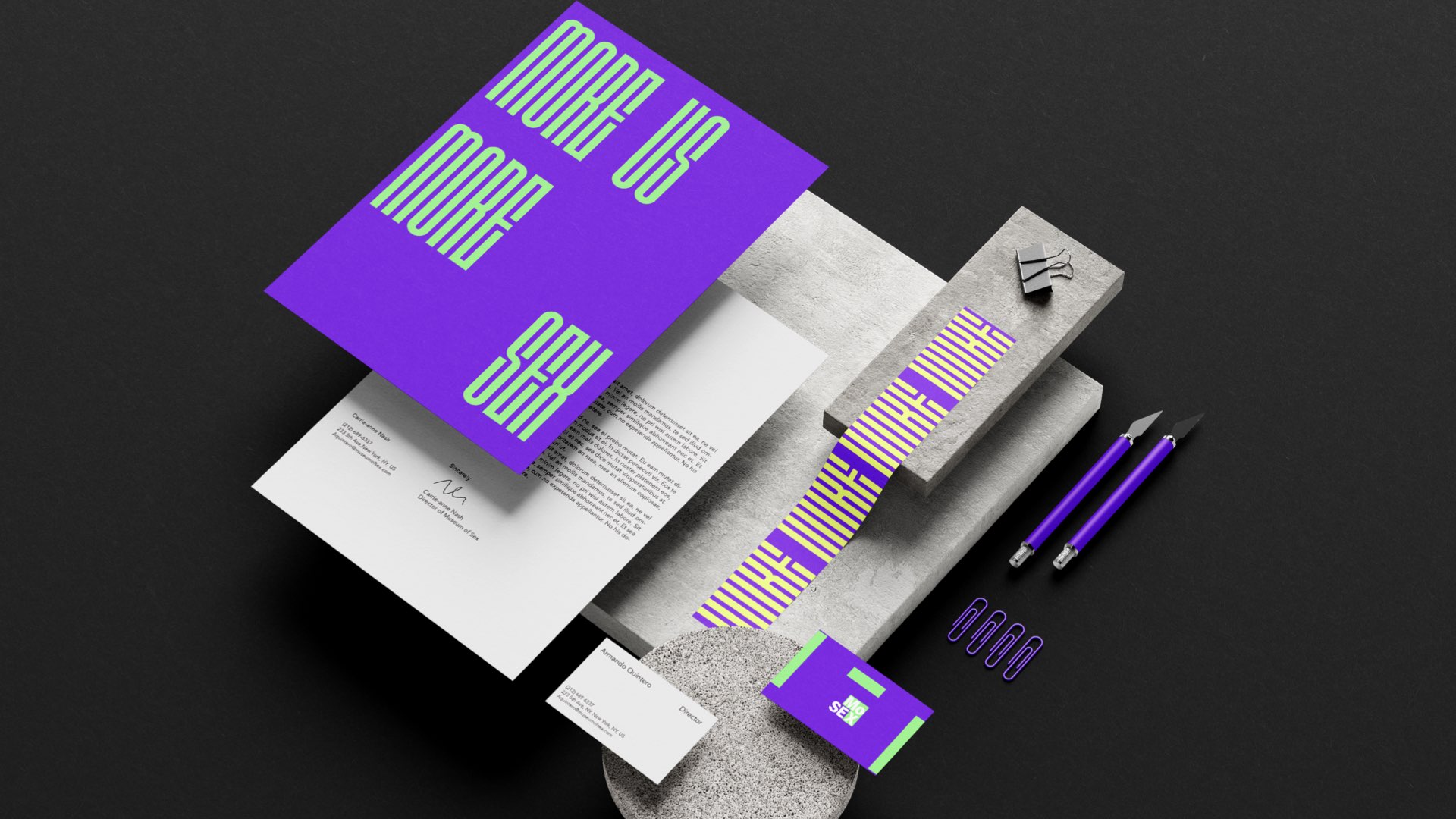
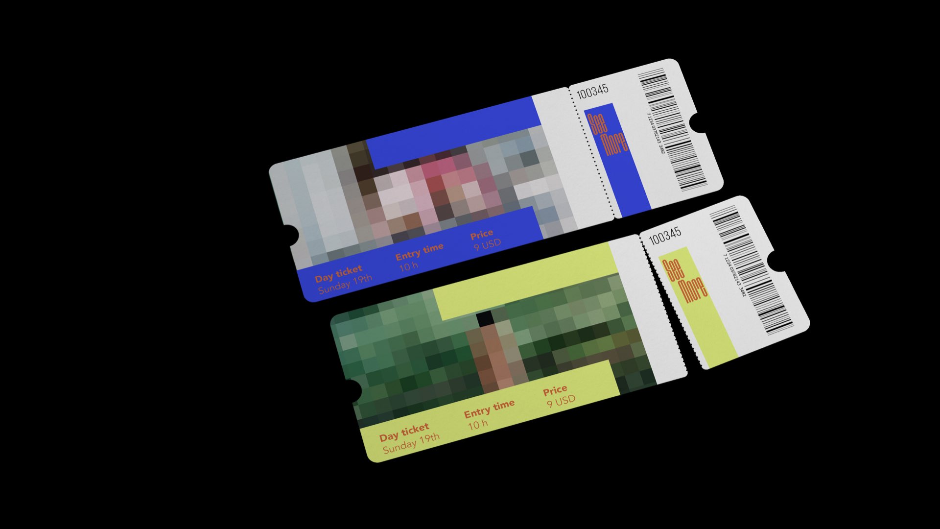
The stationery collection utilized the signature colors and typography, creating a unified and consistent brand experience.

Tickets︎︎︎
Spanking Toy︎︎︎

Environmental Design︎︎︎
